

DocOpp
Streamlining Recruitment for providers
In my role as UX/UI Designer, I was responsible for:
-
Research: Conducting in-depth research to understand the needs of doctors and employers, and how best to meet those needs.
-
Design: Crafting user-centric wireframes, establishing a brand colour, and engaging UI elements.
-
Collaboration: Working alongside developers, stakeholders, and project managers to ensure alignment with project goals and technical feasibility.
At a Glance
Providers often find it hard and cumbersome looking for jobs in their busy and hectic schedules. Our solution with DocOpp was to connect employers with the providers, seeking the candidates they seek, reducing the apply-reject turn around time.
Impact
-
40% faster and accurate resume parsing
-
60% reduction in user drop-off
-
30% increase in provider response rates
Focus Group & Competitive Analysis
A group of 10 users from both medical and non medical backgrounds were gathered to discuss everything related to online recruitment process to gather insights, opinions, and reactions in a structured but open-ended conversation.
Key Takeaways
🔹 70% of users found existing document retrieval systems confusing and time-consuming.
🔹 85% of providers mentioned a lack of streamlined workflows for processing requests.
🔹 60% of users abandoned the process midway due to poor UX and long response times.

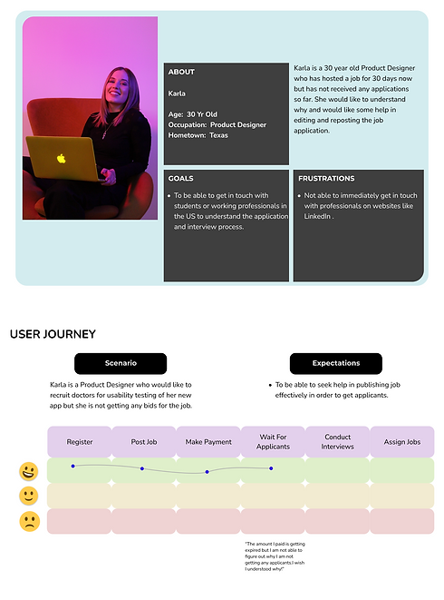
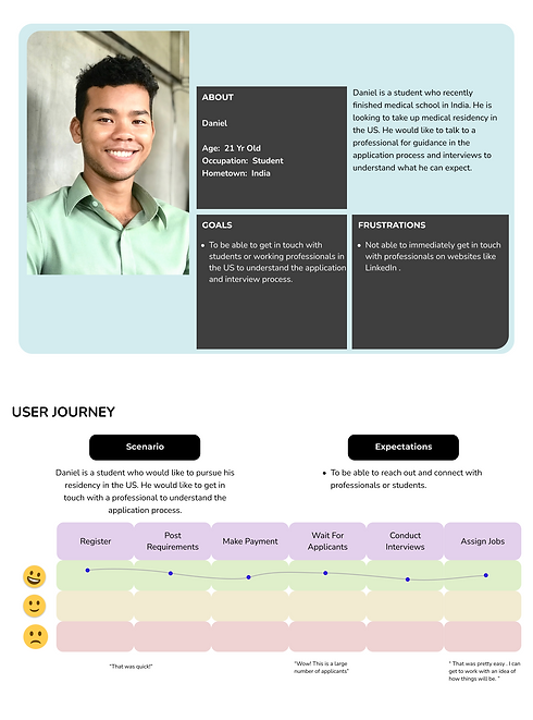
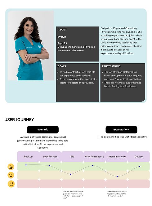
User Persona

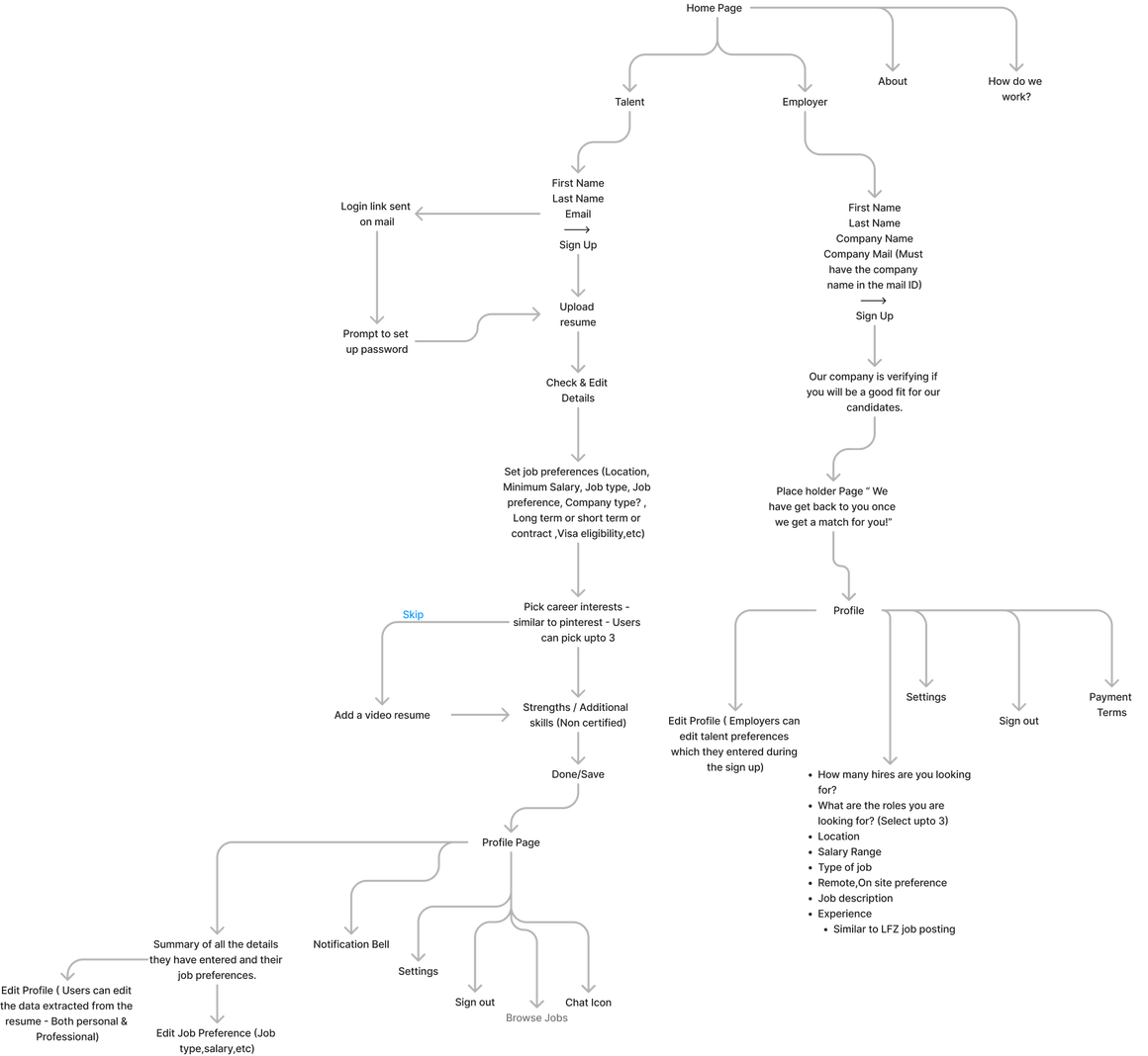
User Flows
Based on the competitive analysis ,this user flow is intentionally crafted to retain familiarity, ensuring that while it offers a unique experience, it still retains elements that users are accustomed to from similar products. This approach aims to provide a seamless transition for users, enhancing usability and engagement.
Design Guide

One of the instructions given by the stakeholders was to not reinvent the wheel. As I was working in close collaboration with the development team ,who were working on a tool to parse resumes uploaded, it was necessary that I had to hold the line taut that was connecting design, business and development.
Some of the features we had to keep in mind was signing up with their work email for employers to reduce the spam from contractors for the employees ; an about section for companies for the employees to understand and dip their toes into the culture of the company.
I carefully considered the varying levels of technical literacy among healthcare professionals while designing the application. Our research from other web apps under our umbrella highlighted the need for an intuitive interface to accommodate users who may not be as experienced with technology, ensuring accessibility and ease of use for all.


Login Screens
Dashboard Design
Things that we kept in mind for a seamless design approach
-
Standardized Forms: User data collection forms remained unchanged.
-
Intuitive Dashboards: Designed for easy readability using colors to minimize employer time on them.
-
Single-Page Data Display: Reduced multiple clicks by consolidating all information onto one page.
-
Improved Navigation: The initial design had too many highlights without details, causing users to navigate back and forth. The new design enhances transparency.
-
Employer Dashboard: Intuitive interface for employers.
-
Talent Dashboard: Includes editable profile information.
-
Jobs Tab Notification: Pings whenever an employer shows interest or extends an offer.
-
Job Postings Management: Initially sorted manually on the admin panel based on talent profiles, later automated using keywords.
Talent Dashboard
The dashboard displays the information about the talent and gives him the ability to edit the data there. This is what is seen initially by the company to qualify him for a job. "My Jobs" on the side bar will show him a list of jobs the companies have approached him for.

Talent Dashboard - My Jobs
Once the talent accepts the job, our admin panel will disclose the contact information of the talent, after which all communications will happen via email.

Company Dashboard
Green Tabs - Optional Action
Orange Tabs - Immediate Action
Red Tabs - Nothing to Show / No Updates

The initial design included numerous highlights without details, causing users to spend a lot of time navigating back and forth.

Company Profile

What problems were solved?
-
Employers contact talents, reducing the time of the talents in applying jobs.
-
Talents get to know about the companies with the company profile page.
-
The UI is simple keeping in mind the technical literacy among healthcare professionals based on previous research.
-
Single page dashboard for employers which housed all the data relevant for them to keep close eye on activities.
-
A no fuss dashboard for talents to reduce their time spent on scrolling for jobs.
-
Signing up with only work email(For companies) to eliminate contractors and fake postings.
-
Reducing spam for talents by filtering out the companies that contact them through a backend admin panel that will only be accessed by the DocOpp team.
Challenges
-
Getting talents to signup in an entirely new platform from an existing platform was a challenge. Users found it to be a double work.
-
Unable to find a proper business strategy to scale the project.
-
Companies were not desperate enough to seek talents as opposed to being applied for the position.
-
The resume parsing tool was not able to effectively auto populate data as each the resumes varied in formats, individual to individual. This resulted in the users correcting the existing data or refilling the data.