

Fye
A 5-year Journaling App
Problem Statement
People have stopped using Facebook,pretty much. But the ones have active accounts on facing use it for one thing - Facebook memories. No matter how cringey they are,its definitely fun and thought provoking to look back 5 or 10 years back.
Many people want to reflect on their personal growth over time, but traditional journaling often feels overwhelming, time-consuming, inconsistent and the journal itself chunky to carry around. While existing journaling apps focus on daily entries or mood tracking, they rarely offer a long-term perspective.
Users lack a simple, beautiful way to capture a single thought each day — and revisit how they’ve changed over months and years.

Solution
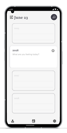
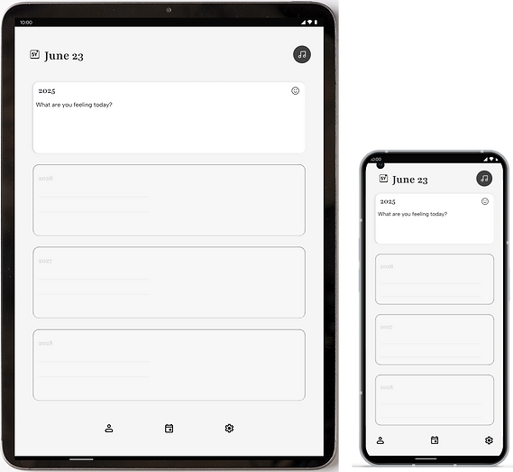
A single page for 5 years of single line entry for users to look back on what was special about the day, how they felt that day, the previous years.
Use Cases
-
A single page for Users looking for a minimalistic approach to reduce physical clutter.
-
Users who aren’t/cannot stay consistent due to a multitude of reasons.
-
Users who want to look at how far they have come.
-
Can be used as a baby’s growth journal, A memoir of their college life or any short term experience they would like to record.
RESEARCH
Year Stack Layout
(Same Date Across 5 Years)
Supporting Data for Fye’s Features Based on User Surveys
83% of testers found the "same-date comparison" to be the most emotionally impactful feature.
61% reported that seeing how they felt last year gave them a sense of progress or self-compassion.
One-Line-a-Day Journaling Interface
71% of surveyed users said they avoid journaling apps because they feel pressure to write too much.
64% preferred a journaling format that takes under 60 seconds to complete daily.
Subtle Visual Cue Tied to Mood
75% of users engaged more when mood tagging took less than 2 seconds and was visual (not text-based).
Mood dots were preferred over text-based mood tags by 82% of visual users.
Add a Meaningful Song
66% of Gen Z and Millennial users mentioned linking music to memory or mood as a valuable form of reflection.
In an open-ended prompt, over 50% said they’d love to log a “song of the week” alongside their mood.
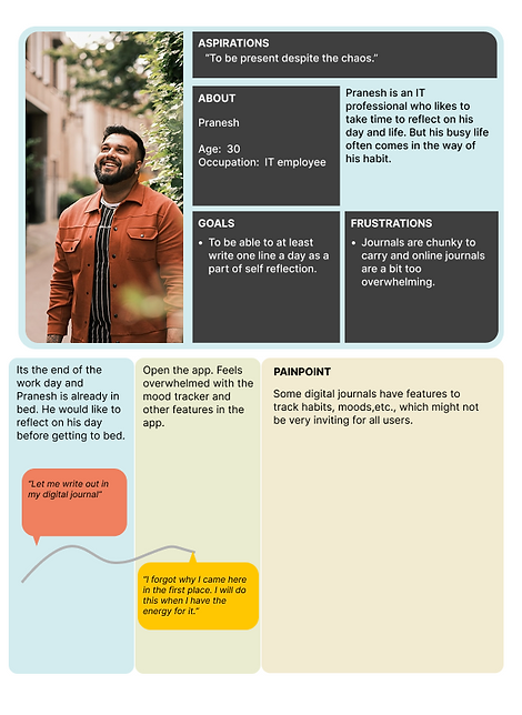
USER PERSONAE & USER STORIES


FEATURES
One-line-a-day journaling interface
Year stack layout (same date across 5 years)
Auto-save on input
Passcode or Face ID lock
Light / Dark mode

Minimalist black-and-white as default
Subtle visual cue tied to mood (e.g. color dot or icon)
Optional calm theme or sepia tone
Daily journaling prompt notification (optional)
Add a meaningful song
SCREENS

Notification Toast
Sign Up Page
Daily Page
Daily Page Expanded

Emoji Coded Calendar
Daily Page - Next Year
Select song UI

Dark / Light Mode
KEY TAKEAWAYS
Designing for emotion requires restraint.
Creating Fye taught me how to design with emotional presence, not visual noise — choosing subtle, intentional moments that invite users to reflect.
Trust is non negotiable
User interviews reminded me that privacy and safety are non-negotiable — even in something as personal as a journal. Every screen needs to feel safe and non-invasive.
Less is more, if done right.
A minimalist, black-and-white aesthetic challenged me to bring out hierarchy, emotion, and usability through layout, type, and motion — not color overload.
Research sharpens design clarity.
User motivations around journaling (emotional processing, memory tracking, low effort) directly shaped Fye’s features — like one-line-a-day input and mood tagging.
WHAT NEXT?
-
Prototype refinement: Build an interactive MVP using ProtoPie or FlutterFlow to simulate gesture controls and key screens
-
Visual polish: Expand UI library, test light/dark themes, and explore animation for subtle delight
-
User testing: Run a short usability study to validate clarity, comfort, and emotional appeal
-
Additional features: Sharing a page with friends ; Non-competitive gamification ; More visual themes for personalization ; Adding birthdays and anniversaries